Nike, Apple, Google, Airbnb: the list of iconic brands that have simplified their logos in recent years continues to grow. It’s said to reflect the strategic choice to modernise one’s brand image, create a more unified visual identity, and ensure logos are easily adaptable and memorable for multiple uses. But what does this shift mean for the future of design?
A simpler logo can mean clarity, versatility, and consumer confidence. When MasterCard’s own research showed that over 80% of people spontaneously recognised the interlocking red and yellow circles without the word ‘MasterCard’ present, they opted to drop it from their logo. Rebranding efforts saw Mastercard’s brand value increase by 25% per a 2019 best global brand report.
It doesn’t always go well. Take the American restaurant and gift store chain Cracker Barrel, which, after 47 years with the same Southern country logo, rebranded in August 2025. The new look stripped back ornate details in favour of a cleaner logo. Some praised the move, but the company faced resounding criticism for erasing the nostalgia and warmth that defined the brand. Nearly $100 million in lost market value later, the company reversed course and reinstated its classic logo.
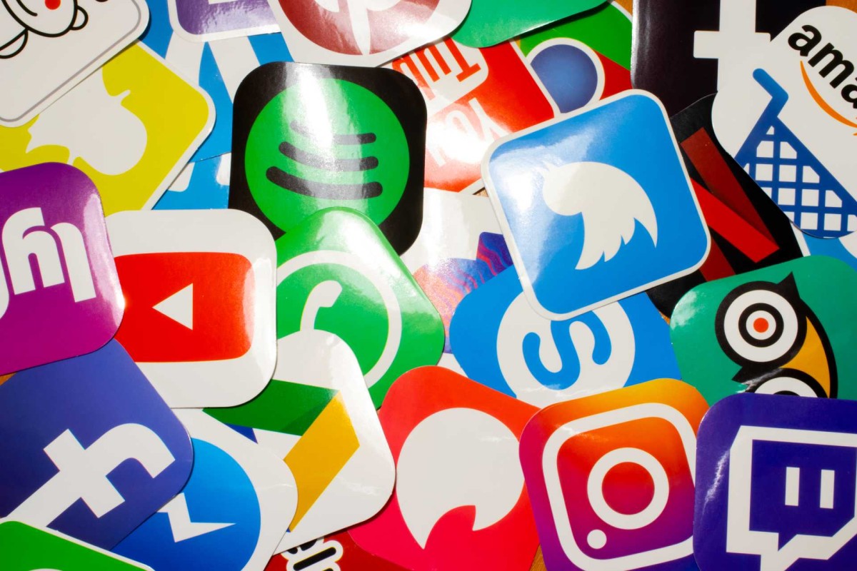
Abby Vanner is the owner and lead creative at Kōwhai Creative, a Christchurch design agency. She agrees that the way we use logos has changed. “In the past, a logo was generally used across many different physical outcomes like packaging, business cards or signage. In our digital age, it now has to work in so many more spaces, from large format advertising right down to social media profiles.”
Abby notes that due to the fast-paced nature of online spaces, people expect increasingly high levels of polish and design quality. “A logo is often the first thing people see online, so it becomes your primary mark of credibility and professionalism,” she says. “In our digital-first world, your logo is the face of your brand, so it has to be instantly recognisable and flexible enough to perform across multitudes of platforms and contexts.”
That flexibility is now a logo’s main requirement. A brand’s character is now expressed through a broader ecosystem of elements, such as photos, tone of voice, typography, shapes, and textures. Beyond these practicalities, maybe simplified logos are a response to the faster pace of modern media consumption. “Psychologically, I think we process clean, geometric shapes more quickly, making them more memorable across fast-scrolling feeds,” Abby says.
AI has an undeniable impact. It was recently discovered that most of the online backlash that Cracker Barrel’s rebrand faced was fuelled by bots. Automated accounts flooded threads and manufactured noise. Trump’s Truth Social post calling out the restaurant chain’s “mistake” played a role, too. Future-proofing design now means anticipating not only audience reaction, but also the artificial and algorithmic.
Perhaps the future of logo design is less about death than reinvention. Modern logos can still have personality. In fact, the best ones are brimming with it. For creatives, the challenge is no longer simply crafting a standalone mark but designing adaptable systems that move fluidly across platforms. Logos remain vital, but they are just one piece of the brand puzzle. Today’s designers must craft versatile, coherent identities that anticipate digital shifts and emerging trends.
“I do think over the next few years, as maximalism edges back into focus, we might see a bit of a renaissance here,” Abby adds, suggesting that even in an age of simplification, bold creativity will always find its place.
SPONSORED